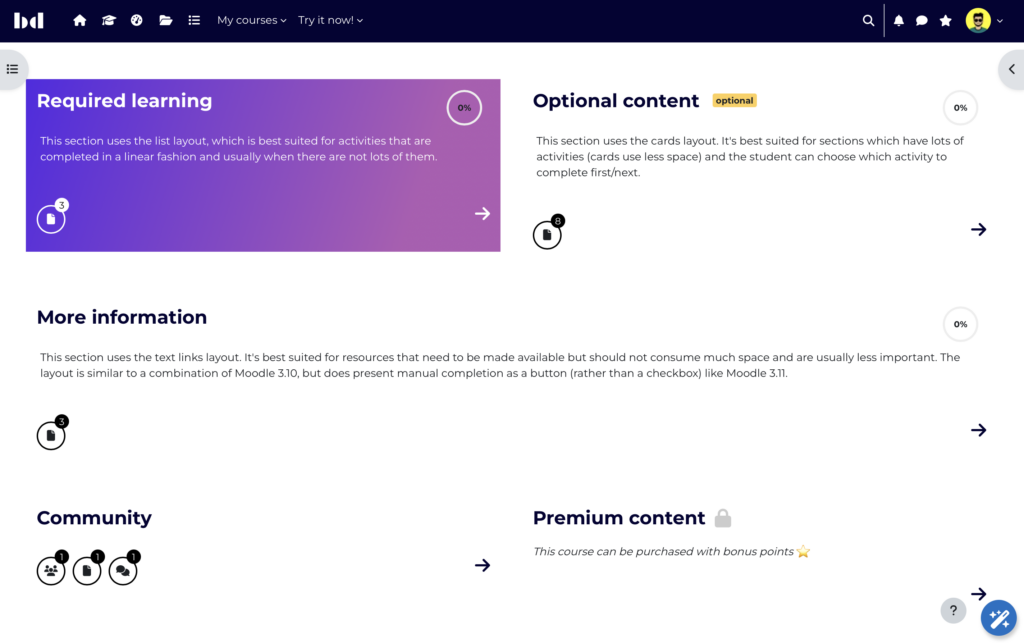
Explore the latest enhancements and features in Designer 1.6 designed to streamline course creation and improve user experience. This update introduces innovative ways to define and display activity purposes, enhances section card customization options, and introduces independent course completion status indicators. Stay tuned for more details on these exciting updates!
What's new in Designer?
Purpose-defined activity icons in section cards
Often, the type of activity (e.g., page) doesn't accurately reflect its actual use, leading to confusion. With the Designer section overview, activity types are prominently displayed with a count, making any mismatch more noticeable.
Designer 1.6 introduces a new feature allowing you to display the "purpose" of an activity instead of its type. Course creators can define additional purposes beyond the core ones and select icons (font awesome) for each purpose. Custom styling can also be applied via CSS. For each installed activity type, a default purpose can be set, though course creators can override this in the activity settings to assign a more fitting purpose. Icons in the section card will then represent the purpose, not the type. Purposes can also be excluded from the section overview if desired.
➤ More about Purpose-defined activity icons


Enhanced section cards – showcase and tease courses, even if they are behind a paywall
In Designer 1.5, section cards were introduced for courses using the one section per page layout. Designer 1.6 enhances this feature by allowing more control over what is displayed in section cards. Course creators can now display information about "unavailable" activities (e.g. behind a paywall) in the section overview. Additionally, section titles and summaries can be displayed on the section page, course page, or both. For restricted sections, a configurable "not available CTA" can be shown. Section cards can also link to any URL, such as a purchase page for the course.

Customizable progress display
The customizable course progress offers several configuration options. Select whether the progress is displayed as a progress bar or a donut. When using the donut, Designer can show a checkmark instead of “100%”.
Configuration options are available to choose how the progress of courses and sections is calculated:
- All activities (that have completion conditions configured)
- Relevant activities (that are selected as course completion conditions)
For the course progress, additional options are available:
- Completion criteria (activities and other courses that are selected as course completion conditions)
- Sections (only applicable to course progress)
A completion status indicator indicates the learner’s progress in a simplified way: enrolled, in-progress, completed.
Note that these options only affect how progress is displayed, not how completion actually works.
➤ More about course progress and customizable progress display.


Completion badge differentiation by date
Enhanced badge colors for more information on activity completion. Activities with an expected completion date (or due date) will get a badge indicating "done on date x":
- Completed in time: Green badge
- Completed after due date: Black badge
- Custom styling can be applied to these badges.
➤ More about due/overdue badges

Enhanced header
Many header improvements (see also 1.5 Release Note):
Configuration options:
- Header type (full width or same width as course content)
- Background and text color
- Background image
- Min-height/Full-Screen
Displaying meta data:
- Time Management fields: Enrollment start and end date, due date, completed date)
- Course fields (Tags, custom fields)
- Course Summary
- Additional content
- User profiles
Course and section progress as progress bar or donut
See also "customizable progress display".


New Designer integration: mod_subcourse
Similar to our Video Time integration, which shows video preview images and watching progress, Designer now integrates with the ‘subcourse‘ activity type from Catalyst IT. This integration displays the learning progress of subcourses directly within the main course interface, providing a seamless overview of learner progression. This support makes it easy for course creators using subcourse as an activity type.
For those creating programs with multiple prerequisite courses in addition to activities within a single course, Designer also offers its own comprehensive program feature.

Enhanced Designer settings
Improvements & simplicity
We have improved the configuration of Designer settings to be more intuitive. Many text fields in the settings have been replaced with selection menus, making it easier to style section and activity backgrounds and adjust mask positions and sizes.
Course background
It is possible to customize the appearance of a course by adding a course background color or image or even set to transparent.
➤ More about color customization
Course type flow: Tile size configuration
Tiles in Designer Flow can now be configured in small, medium, and large sizes to optimize mobile usability.
➤ More about course type flow
Trimmed description of activities
Now, there is a global setting that defines if the description for activities is trimmed.
(Edited by Stefan - original submission Sunday, 11 August 2024, 4:10 PM)
